This week’s Friday Focus will tackle websites for a designer’s best friend: icons. Icon sites have been around for the longest time but we’re seeing a lot of sites pushing the envelope in interface innovation, both with their offerings and the website designs they’re found in. The latest trend so far? Websites created for a single icon set—now that’s a great way to promote work.
Designs of the Week
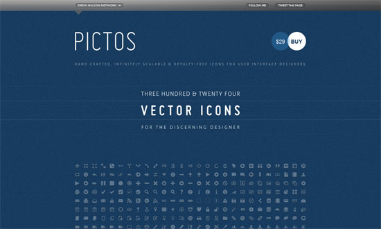
Excellent one page site with the letterpressed look. I wish the bottom gray area had its text a little more readable.
I really like how wide and open this design is. And custom typefaces are more rampant than ever.
A subtle noise effect in Photoshop is popular for a textured effect. So is uppercase text—note the letter spacing for readability.
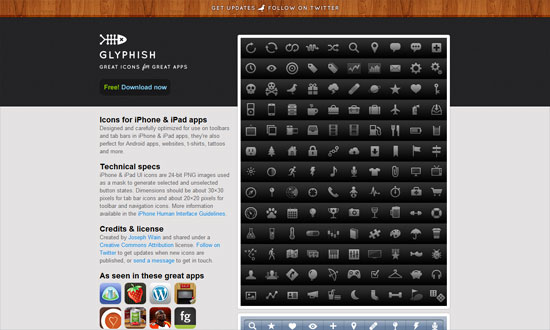
Even more subtle noise texture here, combined with a touch of woodgrain for extra elegance. I feel the text on the left sidebar is a little cramped compared to the amount of whitespace in the header. And the icon preview, which occupies a large amount of real estate, could be clickable.
Love the folded paper effect combined with a bit of blueprint. I don’t need to tell you how strong the grid is on this layout and the excellent Swiss design sensibilities at play here.
I’m enjoying the hand-drawn, torn effects from top to bottom. Even the arrows in the Services area aren’t overlooked. And scribbled down Android robots—what could be more fun than that?
Sometimes a narrow layout just works better. Excellent integration of all the navigation tools from the search to the pagination. If the icons won’t make you lick your screen, the wooden panel probably will.
Lots of content on the front page compared to the other sites listed here, but it’s not busy at all. Of course the drag-and-drop feature on this site is one of the best interface goodies out there.
I like how as you scroll down, it’s one major area, then two, then three.
Really simple but it’s the details (typography, color, boxes) that stay out of the way that make the design work.
There’s something compelling about the choice of fonts on this site but I have to say that the bottom half isn’t so refined. The blog post titles could use bullet icons and the sitemap seems to need a bit of serifs.
We always enjoy Dan Cederholm and his impeccable work as we’ve featured at least one other iteration of this site’s design before. The current one? It just feels so harmonious even with various splashes of color from the different icon sets. I also appreciate a site that lets you scroll, scroll, scroll.
I feel saddened by the ad placement here. Ads can look beautiful if you can help it, but here they just stick awkwardly out of place.
I just have to include this site on the list, because no matter how long this design has been around, it still feels current.
Social Media Weekly
Design – Create Seamless Web Background Textures in Minutes
“Ever wondered how some web designers come up with such great background textures? It’s actually way easier than you might think.”
CSS – Sexy Interactions with CSS Transitions
“With all browsers except for IE being slated to have Transitions support in the coming months, more and more web designers are turning to this powerful technique as a means to enhance their website’s user experience.”
Optimization – Optimizing Your Website For Speed
“In the world of the Internet, you have mere seconds to capture a visitor’s interest before they leave and find your competitors. Can you afford to have them leave just because of your websites speed?”


